Friday, 11 December 2015

Research point: Photographing indigenous people.

Research point: Photographing indigenous people.

Having just returned from Australia from a five week holiday I thought it might be interesting to see how white Australians photograph their indigenous neighbours.  

Australia has to be one of the most fascinating places to visit.  While there we saw breaching whales, wild koalas, snakes, spiders, cassowary, echidna and whole mobs of kangaroos.  What we didn’t see many of were Aboriginal Australians.  Yes, there was a small group performing for tourists in Circular Quay Sydney, but on the whole they were absent.  A report by The Lowitja Institute calls them “Legally Invisible”   The only time we saw them working was at Mossman Gorge where, with the help from the State of Queensland, they have been encouraged to run the rainforest, to which they have been granted stewardship, as a tourist attraction.  This has been a wholly successful enterprise which benefits both the Aboriginals and the visitors.  The last time we were there, in 2006, we we chased out by these very same people.

The history of Europeans landing in Australia has not been a happy one for the aboriginals.  When Captain Cook arrived in 1770 the native population was, it is estimated, between 315,000 and 750,000.  Despite this the English Crown deemed it Terra Nullius, meaning unclaimed.  The locals, despite having lived there for at least 50,000 years, were dismissed and had no rights.  

The attitude of the modern Australian to Aboriginals is, to say the least, mixed.  I can’t repeat some of the negative comments I heard, but follow the Australia News link below and you will get a flavour of them.   Some of the resentment comes from rights given to Aboriginals that are not given to others.  These include hunting and fishing rights, and certain welfare payments.  

With all the above in mind I wanted to see how they were portrayed in print.  Two photographers sprang out as showing a sympathetic tone and displaying honest images.

The first is Alaster McNaughton, English born and living in Fremantle.   The second is Professor Wayne Quiliam, Australia born and living in Melbourne.  

Their work displays a deep knowledge of, and respect for their subject.  They do not patronise nor do they put their subjects on false pedestals.  These are honest pictures of people with a long history and deep rooted beliefs.  By working with people they know and respect, these two photographers have avoided the usual traps of artificiality and the distancing of the subjects from their culture. 

It is only too easy to find pictures of Aboriginals who have not coped with modern Australia and who turn to drink and/or drugs, but I am not about to re-publish them here.   

The lesson would seem to be, get to know the subject and treat them with respect.


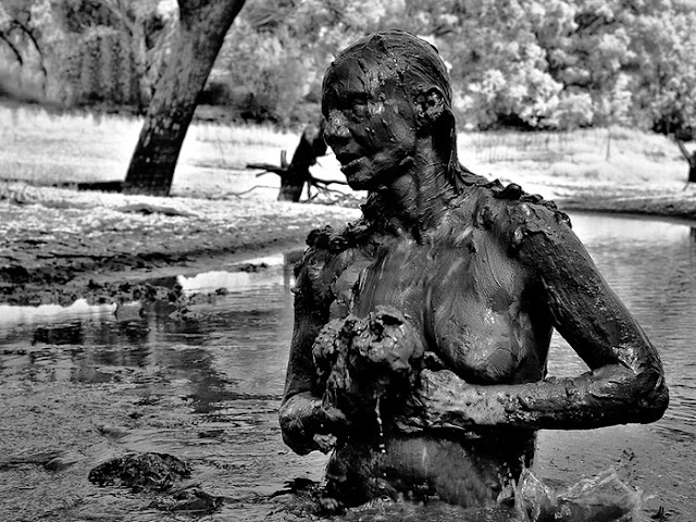
Wayne Quilliam


Wayne Quilliam

Alaster McNaughton.


Alaster McNaughton.


References: 

AUSTRALIA NEWS. (2011). Australia’s apology to Aboriginals. 2011. [Online] Available at:
[Accessed: 11th. December 2015].

INDIGENOUS LAW CENTRE.(2015). Wayne Quiliam. 2015. [Online] Available at:
[Accessed: 11th. December 2015].

LOWITJA INSTITUTE.(2011) Legally Invisible Report. 2011. [Online] Available at:
[Accessed: 11th. December 2015].

ORIGINAL ART PRINTS.(2011) Alaster McNaughton. Australian B/W Photographer. [Online] Available at: 
http://www.desertimages.com.au/art-print/
[Accessed: 11th December 2015].

THE GUARDIAN.(2014). Australia through the eyes of Wayne Quiliam.

[Accessed; 10th. December 2015.
Thursday, 10 December 2015

Exercise: Press release.

Exercise: Press release.

Brighton Photo Biennial.

Images of war come with a special price; the lives of the photographers themselves.  During the the various conflicts in Vietnam, from the French occupation through to the fall of Phnom Penh and Saigon, 135 photographers lost their lives or went missing.  During the Iraq conflict 27 photographers died.  The list goes on.  This exhibition is a small tribute to their work.  

In this exhibition you will see pictures covering one hundred years of conflict.  Some were taken by professionals, some by amateurs, some by victims, some by soldiers, and some by tortures.  From live action to the dreadful destruction of cities, this exhibition covers it all.  What is demonstrated here is how war effects all of us.  It is not only the combatant, but also the displaced civilians and the destruction of normal life and the whole fabric of civilisation.  How health, education and normal governance cease to function.   

The most shocking are the images taken by Lynndie England, the Abu Ghraib guard, who abused her position to humiliate and brutalise her prisoners.  These are not pictures taken of her but pictures taken by her.  So proud was she of her brutality that her took pictures of her own crimes.

This is a set of images that, unfortunately, will be replaced be other sets of images of future.  As one conflict ends another begins.  A circle of violence that seems to have no end and to which news editors will send another generation of photographers.   How many times will be repeated the politicians favourite phase, “This must never happen again”. 


Monday, 7 December 2015


Exercise: Guardian use of Guerrero's photograph.

The El Pais link to this image has been blocked.  Likewise The Guardian have removed their link to the original image allowing access only to the subsequent doctored images.The use of photo altering software makes it only too easy to amend images and so prevalent has it become that on 18th. November this year Reuters issued the following,  "Hi, I’d like to pass on a note of request to our freelance contributors due to a worldwide policy change.. In future, please don’t send photos to Reuters that were processed from RAW or CR2 files. If you want to shoot raw images that’s fine, just take JPEGs at the same time. Only send us the photos that were originally JPEGs, with minimal processing (cropping, correcting levels, etc).
Cheers,".

This is aimed  at stopping the submission of images that have been altered while in RAW.

The question was, what would I have done with the Spanish image?  I would have showed the image in full and in colour if available.  That was the truth about the bomb blast.  I would not show recognisable images of the dead, such as a close up of the murdered soldier Lee Rigby, but that arm was part of the scene, was unrecognisable, and gave an impression as to what barbarous people are capable of.  The picture of Lee lying in the, otherwise, empty street was such a powerful image that further detail was unnecessary.

Reference:

Zhang, M.  Reuters issues a worldwide ban on raw photos. [Online} Published on November 18, 2015 Available at:
http://petapixel.com/2015/11/18/reuters-issues-a-worldwide-ban-on-raw-photos/Published on November 18, 2015 

But Should You Print It.

So we arrive back at the subject of censorship and who says what is permissible.  The article is very wide ranging and detailed in it's observations.  I deal with each of the four areas separately.

Faking:-  Should never be allowed.  If no image of an event exists then by all means show a reconstruction, but say that it is a reconstruction.  Leave the fakery to advertisers and propagandists.

Decency:-  So readily available is internet pornography that the idea of censorship on the grounds of decency seems rather quaint.  On 16th January this year The Sun "newspaper" printed it's last Page Three Girl.  What in 1970 seemed so daring and racy is seen in 2015 as mundane and trite.  There is no need to cross the pubic barrier; it was breached years ago.  Even top shelf mens magazines are dying on their feet due, in the most part, to internet porn.   Why bother print what those seeking titillation can find free online. 

Privacy:-  Here is a message for the rich and famous.  When in a public place don't do anything that may embarrass you, for without a doubt someone will have their iPhone trained and ready to snap.  The days when the paparazzi were the only danger are long over.  The choice to print or not is one of taste and public interest.  What the editor rejects will appear on You Tube anyway.  What readers of The Sun find interesting is very different to those of The I.  Each editor must know and recognise his market.  I have no interest in personalities, soap stars, footballers, or game show hosts so will never buy a "Red Top" newspaper, but I recognise the were I the editor of such a publication this would be part of my daily output.  There would still have to be a limit, and I would draw it at truth, and what hurt it may cause innocents caught up in the story.  

Violence:-  The theme of whether or not the presence of the camera resulted in death is an old one.  The Eddie Adam picture of a South Vietnamese police chief shooting a  Vietcong prisoner is a case in point.  Was this man murdered just because the camera was there or would he have died anyway.   The use of horrific images in general must rest with their importance to a story.  The Vietnam War was big news item in my youth.  The news of the war was largely a diet of propaganda and falsehood mixed up with a smattering heroic tales of the brave and willing US soldiers.  It took the picture of the napalmed girl to bring home to the horror of what was being done in the name of freedom.  If the message is strong then so must be the images that back it up.  


Had there been more images such as that of the Iraqi soldier then perhaps more people would have challenged Blaire's lies about why we went to war and the lack of planning for peace.  

I agree with the article in that those who criticise the use of graphic war photographs do protest too much.  Before we are led into war show us what war means, and that includes displacement of people as well as death and injury.   Less of the "Shock and Awe" and more of the pain and suffering.   

I still can't watch the events of 9/11.  I find them too shocking and too disturbing.  This does not  mean that the images should not be out there or that I want them removed or censored, but it is my my choice not to view them.    


Saturday, 5 December 2015

Exercise:The Ethics of Aesthetics.

Exercise: The Ethics of Aesthetics.

Below is the entry I made on the blog post.

I looked at Stoddart’s, Rankin’s and, Chaskielberg’s pictures without reading the text first.  I wanted to see what the impact would be without the stories behind them.  

The Chaskielberg pictures, except for the colour, could have been taken on some long past Grand Tour.  The subjects are posed, the lighting is very controlled, and there is no obvious sign of distress.  The only hint of future trouble is the number of children.  

Rankin’s pictures are also posed, but are more pointedly carrying a message, although it is only in the repeated use of the handful of maize image that it comes through.   The differing camera angles give interest to what could have been a boring set of pictures.  There is, however, little in these images to intimate starvation or the need of immediate aid.  The people appear well dressed, the children looked nourished, and there is evidence of livestock.  Without reading the text there is no immediacy. 

Oxfam may not like pictures of fly blown children and stock shots of staving people scrambling for food aid, but the images by Stoddart have the power to move.   These are the pictures that the World should be made to look at.  To confront people to see what over population, poor governance, and diminishing resources will lead to.


Of the three main pictures in the article the one that conveys the true tragedy of famine is the one by Stoddart.  One doesn’t need to see the whole person.  These legs alone carry the message of hunger, displacement, despair, and hopelessness.

The link below to the El Pais image is now restricted and cannot be viewed.

http://elpais.com/elpaismedia/ultimahora/media/200403/11/espana/20040311elpepunac_1_P_PDF.pdf

Friday, 4 December 2015

Exercise: Imaging Famine.

Exercise: Imaging Famine.

Ethiopian statistics make interesting reading.  According to available figures from Africa Economic Outlook the current population is about 86 million. The GDP is $121 Billion with economic growth running at over 9% PA.  So much for the good news.  

Now for the bad.  In 1950 Ethiopia had a population of 18 million.  In 1984, at the height of the famine, the population was 40 million.  It is predicted by AEO that by 2050 the population will reach 148 million.  The median age is 25 and 42% of the population is under 14.  Ethiopia has 80 ethnic groups sharing 90 different languages and three major religions.  It’s government weak and corrupt.  

Ethiopia only comes to notice in times of war or famine.  As usual bad news is good news when it comes to selling news papers.

The Ethiopian famine was certainly bad news.  The famine of ’83-’85 is estimated to have killed between 400,000 and 1,000,000 people.  The then president Meles Zenawi, who followed Mengistu Haile Mariam, admitted that he did not have the resources to combat the impending famine that was blamed on a poor harvest.  The world respond with food aid, NGOs moved in and the rich and famous rode their band wagons into the front line.  Pictures of the famine’s victims, mountains of food aid and images of the aforesaid rich and famous pleading for more aid were to be seen in every paper and on every bill board.   The positive result of this was the saving of many lives, but the down side was to ever link the name Ethiopia with failure, famine and poor governance.  

According to All Africa the Ethiopia Government is warning NGOs not to use the words “famine, starvation or death” in their food appeals.  Neither are they to say that “children are dying on a daily basis,” or refer to “widespread famine” or say that “the policies of the government in Ethiopia are partially to blame.”  Neither are they allowed to “compare the current crisis to the famine of the eighties.”  Instead, the latest drought in Ethiopia is to be described as “food insecurity caused by a drought related to El Nino.”   Thus the next food shortage and famine will not be the fault of Government, the population explosion, or ethnic tensions but will be blamed on global warming and the increased incidence of El Nino.   

The point is never made that with a permanent food deficit, an exploding population, regular harvest failures and weak governance the  probability of famine is ever present.  

During the famine of ’83-’85 there was a degree of self censorship as to what pictures news papers published.  As is said in the article, the really gory images were not to be used, so the published fare tended to be the generic pictures of dusty plains and unposed and fault free victims.  They all had the look of images taken by outsiders rather than by the people themselves.   How images of the next famine will look with Ethiopia’s Government taking a tighter grip on what the “truth” is will be interesting.  What is for sure there will be more.

I found it patronising for The Guardian to say that the events in one part of Africa, be it Ethiopia or any other country, leads us to lump all of Africa together.  As the article said, Africa consists of 57 different and distinct countries each with their own set of strengths and weaknesses.  It is because the media concentrates only on what is wrong in Africa that this image is sustained.   There is still  too much of the Van Der Post, “Africa wins again”, in the reporting of African stories.  Look for the worst and you will find it. 

During the 1993 Sudan famine the photographer Kevin Carter took a photograph that one him a Pulitzer Prize following it’s publication in the New York Times.  It depicts a small dying girl being stalked by a vulture.  Following the publication of the image, Carter received a lot of criticism for not doing more to save the girl.  So much did this effect him that within three months Carter had committed suicide.  This is a very powerful and graphic image that illustrates the real horror of famine.   There is little hope in the image.


A less graphic picture of famine was taken by Mike Wells during the Uganda famine of 1980.  It shows a wasted black child’s hand in the palm of a well nourished white hand.  The message here is very different.  It not only shows the effect of famine, but also gives a feeling of help and support.  This is a far more  hope in this image.  There is second message that, again, it is the white West that is coming to the aid of Africa.


These two images are far from the stock pictures of piles of food aid, Bob Geldof, and mass migration that is the usual fare.  The Carter and Wells images were original, powerful, and honest.

References:

2015 Index of Economic Freedom. [Online] Available at:

Ethiopia: Famine, Starvation and Death in Ethiopia Renamed by Its Government as "Food Insecurity" [Online] Available at:

Iconic Photos. W. Willoughby Hooper on Famine. [Online] Available at:


Wednesday, 2 December 2015

Exercise: ‘Walk the Line’ and ‘Imaging War’.

Exercise: ‘Walk the Line’ and ‘Imaging War’.

Both these articles deal with the delicate subject of censorship and who holds the blue pen.  Many have the power to say what others may or should see.  Kaplan sees the gore of war but is willing only to produce black and white images for a planned book.  The editing group pull the plug on the whole venture on  the grounds that the public may find them too strong and not buy the book.  

There is a lead into this exercise from the last exercise on “The Gaze” and who wields power. 

In the case of the victim of war the subject has little or no choice as he is not usually in a position to walk away or exercise any choice as to how he is portrayed.

The photographer has the choice not only of whether or not to take the shot but also how he wishes to rely the story in the picture.  To show the subject as aggressor, victim, villain, or bystander.  Whether to show him in a positive or negative light.  The artistic choice of colour or black and white.

The editor/publisher has a major say in what and how to publish.  Not strong enough and no-one will be interested; to strong and people will be put off buying.  

The public (the reader’s gaze) possesses the power to apply it’s own censorship by buy, ignore or object to the images.  

The non-Westerner’s gaze is there in how he sees how he is not only judged but in how he is portrayed.

The Westerner’s gaze exists in how he sees that portrayal.  This is a different judgement to the public’s or reader’s gaze in that it can only exist after acceptance of the images and reasoned thought about them.

The academics gaze comes later and and will judge the effect of all the earlier actions.

Should the true horror of war be filtered so that the public should not be offended?  To make war look less gory is to make it more acceptable and possibly more likely.  I am no pacifist but if my country is being taken to war I would like to know why and what the likely consequences will be, rather than the sort lies that were told by Blair surrounding Iraq and it’s WMD and the subsequent ‘World of War’ video game coverage of the war itself.  

Suppress too much of the horror and trust is compromised, allow too much and no-one will believe it.  

There is indeed a fine line to walk and sensitive questions to answer but I as a photographer can only take the shot.  A missed shot is gone forever; a shot taken doesn’t have to be used.   


Wayne Gretzky, the Canadian Ice Hockey, once said, “You miss 100% of the shots you don’t take”.  This quote about sport can easily be applied to photography.

Sunday, 29 November 2015

Exercise: The photograph as an Intersection of Gazes.

Exercise: The photograph as an Intersection of Gazes.

Before reading this article I had only considered three interested parties as being interested parties in a photograph: the subject, the photographer, and the viewer.

This article certainly challenges the way I view an image but is not the way I take an image.  The Institutional Gaze is still mine in that I carry out my own editing, cropping, and selection.  The rest is down to the viewer.

My photographs practice changes according to the circumstances and what I want the image to say.  I have obtained images both with and without the subjects permission, but I hope without exploiting them.  

The following three images were taken with a different message in mind.


The first was for the Digital Practice module of this course and was taken in Spain.  This was a set that I took to show how the financial crash had affected Spain.  The subject was a willing, and genuine, participate.  She is holding a card that roughly states she is desperate for a job and is good at domestic work.  I wanted to make her look as pathetic as possible so as to highlight the poverty that some people had fallen into so photographed her from a high and so as to diminish her.  My then tutor said I had been unkind to her but I achieved what I set out to obtain.


The second was an attempt to show how pictures can tell lies.  The scene is the main street in Canterbury, the two boys were in fact obviously students from the University.  This is a picture I took on the fly from inside my flapping coat.  The subjects were unaware.   The angle of the image, the close cropping and the fact there are three Afro Caribbean and one lounging white man give an edgy feel to the image.  This was in reality an innocent scene, but the way in which I presented it tells a different story, and is a lie.  


The last is one I took in holiday is obviously taken with the permission of the subject.  A straightforward portrait in good light with a little fill in flash.  


I, as the photographer, can only control a number of the Gaze possibilities; the rest are up to the viewer.

Project: Gaze and control.

Project: Gaze and control.

Power/Knowledge.

At the start of this piece David Green states that reading Foucault can be difficult.  I have come across his writings throughout this course and still find him difficult.  

In this piece we are asked to view power as a positive force that enables man to obtain knowledge rather than a negative influence that controls and stifles man.

The accumulation and spread of sound and true knowledge is dependent on the exercise of positive power.  Power and knowledge go together.

Truth can only be arrived at through discipline and is constraint not the product of free thinking.  Every society has it’s method of testing for the truth and those make such decisions wield power.

Disciplinary Power.

In Foucault’s Discipline and Punishment the change in penal regimes from using physical punishment to change future conduct to an attempt to change the behaviour of prisoners by observation and persuasion .  The change the soul rather that punish the body.  

People who know they are under observation react differently to those ignorant of the fact.  Thus the ‘Panopticon’, as devised by Jeremy Bentham, was a way of observing prisoners with them seeing the observer.  The idea of the unseen observer is now applied as CCTC which is employed widely both inside and out in the street.  

Foucault points out the interdependence of power and knowledge.  He claims that power does reside with with a single body in society but is exercised throughout society by the many.  A knowledge/power relationship is present in all social interactions.  

At this point I lost the will to live.

Photography and Power.

Photography became a powerful tool in the recording of, and categorising of people and was seen as a true representation of what was observed.  It allowed close scrutiny of those being observed and permitted unfair and misguided comparisons to made between the world of the observer and the world of the observed.  By isolating the subject from it’s normal surroundings context is lost and a false image can be manufactured.


According to David Green the power wielded by the photograph invites resistance, but this power is so strong as to render any meaningful resistance futile.  All one can do is find new ways of working with photography in the fields of observing, recording, and reading.

Assignment Three. Visual storytelling.

Assignment Three.


This is my second attempt at Assignment Three.  I took these pictures whilst in Australia with a mind to use them for this assignment but then went for the hat angle.

Link to pdf below.  Cut and paste to browser please.


https://drive.google.com/open?id=0B5nvwo4D2lyvZ0VuNFBlalFNbnM

Visual story telling.

Of all the assignments, so far, this one has given me the most trouble.  I have had ideas aplenty, but few that would work as a story.  A day out seal watching with friends that ended with only five usable pictures.  The pre-Christmas visit by the grand children.  Loads of inside shots of messy kids, but the weather was so foul all the planned outside visits and therefor outside shots had to be abandoned.  A day out to Dungeness with a friend supplied some decent images, but only suitable for the Landscape Module.

In the end I fell back to my trip to Australia last year.  I had originally intended to use it as the basis for this assignment but as I only took my Canon G12 and my Canon G1X I wasn't sure there was sufficient lens variation to fit the criteria.   The holiday consisted of travel from Perth, in the south west, round to Port Douglas, in the north east, via Adelaide, Melbourne, Sydney and many minor place in between over a period of five weeks.  The mode of transport covered plane, train, car, and ferry.  I looked originally to pick out part of the journey and use it a the theme for the assignment but even as I took the shots I could see I was making a travelogue and that was not what I wanted.  I tried the train, The Indian Pacific, but again couldn’t make it work.  The road journey, from Adelaide to Sydney,  was fantastic but it was just that, a road journey: lots of photographs but again a travelogue.  It was only when I went back over them I found my theme: hats.  Not the usual Aussie caricature of the Akubra with corks but various hats, and their wearers, that we come across, plus the loss and replacement of a hat owned by one of travelling companions. 

The tale of a hat lost, a hat replaced and other hats.  Abandoned in favour of Trolly version below.


I’ll deal first with that hat lost.  Christine, one of our travelling companions, brought with her her white sun hat to deal with the hot and harsh Australian sun. 


The first image is of her wearing that very hat on a trip up the River Clyde at Bateman’s Bay, NSW.


The second was taken on a Quicksilver ferry on our return to Port Douglas following a day on The Great Barrier Reef.  When Christine stood up to take a picture of Crocodile Island she forgot we we travelling at about 40 knots, (46mph), and off went her hat.  


The following day a very fetching pink number was purchased to replace it.


In Perth we visited the Old Jail where a guide, Matthew, did a passable impression go prison guard in the 1967 film Cool Hand Luke. 


Also in Perth we came across a very un-Australian use for a hat: begging.  I like this picture as it shows the indifference of others in the street.


I include the man in the balloon hat for no better reason that he put a smile on my face.  


The Indian Pacific train makes only two stops on it’s journey from Perth to Adelaide, one at Kalgoorlie, and one at Cook.  Kalgoorlie is the worlds largest gold mine, but unfortunately our stop was too short to pay it a visit.  Cook is a ghost town left over from when Australia had a variety of track gauges and Cook was where they all met.  The photograph is an example of Brownian Motion in action.  There is almost nothing to see but everyone is milling about aimlessly thing to find something.  Some with hats and some without, but all practicing their Aussie Salute in a bid to rid themselves of the very persistent flies.


In Adelaide we visited the Botanical Gardens where I saw this charming image of a mother and her two daughters dabbling in a hothouse pond.  Hats laid aside in the shade of the house.


In the tourist town Central Tilba NSW is Wulaga Gallery, new age shop producing, amongst other items, it’s own hand crafted jewellery.  Heather, the jeweller, always seemed to sport her woolly hat; no matter the weather, inside or out
.  


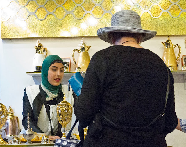
The last is a picture of old and new Australia.  Taken in Sydney's Paddy's Market it shows Old Australia, as represented by the customer, and  New Australia, as represented by the elegant stall holder.  The woven hat versus the head scarf.

Assignment Three.  Second attempt.

The Tutor notes attached to the work in my submission folder relate to the aborted first attempt. I contacted OCA to see if there was another but no other has been received.

This is my second attempt at Assignment Three.  I took these pictures whilst in Australia with a mind to use them for this assignment but then went for the hat angle.

Link to pdf below.  Cut and paste to browser please.

https://drive.google.com/open?id=0B5nvwo4D2lyvZ0VuNFBlalFNbnM


Plain copy lo res version.


Whilst in Australia last year I spent a week in Port Douglas up in Queensland. The town had a successful early history as a gold and timber centre. It’s natural harbour made for easy transport of the timber to Cairns. The laying of a railway killed the trade and by 1960 the population had dwindled to fewer than 100. It’s fortunes changed when visits to The Great Barrier Reef started to become feasible and popular. Fast second hand Tasmanian ferries were brought in and trade flourished.
The permanent population now stands at over 3000, is solely dependent on tourism and caters for over 350,000 holiday makers each year.
In addition to the normal tourist shops there is the ubiquitous Coles Super Market.
Whether it’s the wild nature of the area or just a wish for freedom I can’t say, but the Coles trollies seem to have the wonder-lust. Having noticed their proclivity to roam I started to take pictures of them and give them life by imagining how they arrived at their new locations and what they were up to.


Some use their spare time with a bit of window shopping. A chance to see what else Port Douglas has to offer other that fresh milk and buy-one-get-one-free offers.


Others use the opportunity to hang out with their mates.


Not all such gatherings end peacefully and fights break out.


Making friends with larger relations is not unheard of as can be seen by this one cosying up to a large wheelie bin.


Many of them go feral and make their homes in road side waste areas.


There is always the temptation to find a new home and new friends.


This one seems just plain lost, without purpose and waiting for collection.


Hiding out during daylight hours seemed a good plan for some of the renegades.


Making friends with the wrong containers could end up with a ride in the back of the garbage truck.


The usual fate for the free thinking trollies is capture and a return to Coles. Here is a collection of run-aways awaiting collection by The Trolly Man.